––– BNY MELLON –––
Streamlining wealth management
I led UX/UI design across a 4 month programme delivering 11 end-to-end journeys shipped across 8 account types
Role
UI/UX Design Lead
Project type
SaaS platform
Client
BNY Mellon/Publicis Sapient
Timeline
December 2023 - March 2024
Challenge
BNY Mellon’s adviser platform Nexus® was failing to meet advisers expectations for setting up investor accounts and came with a host of issues, causing delays in account opening, impacting client attraction and retention. Pain points included:
Outdated 20+ year old application requiring constant workarounds
Onboarding and maintenance processes were fragmented and inefficient
Manual data entry, inconsistent field structures, and legacy systems cause delays and errors
User journeys didn’t support the customisation needs of different client personas
UI/UX not intuitive or user-friendly
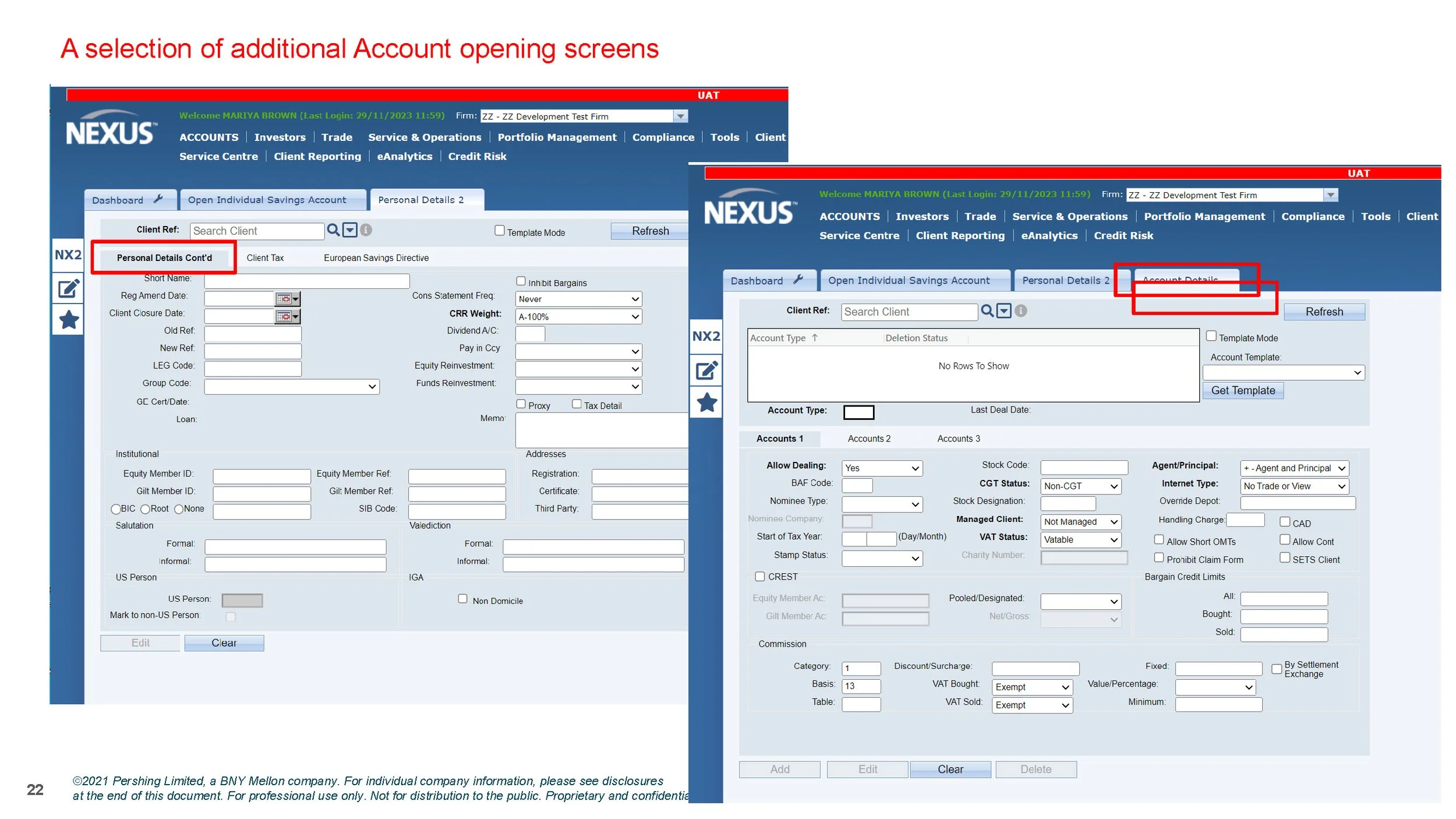
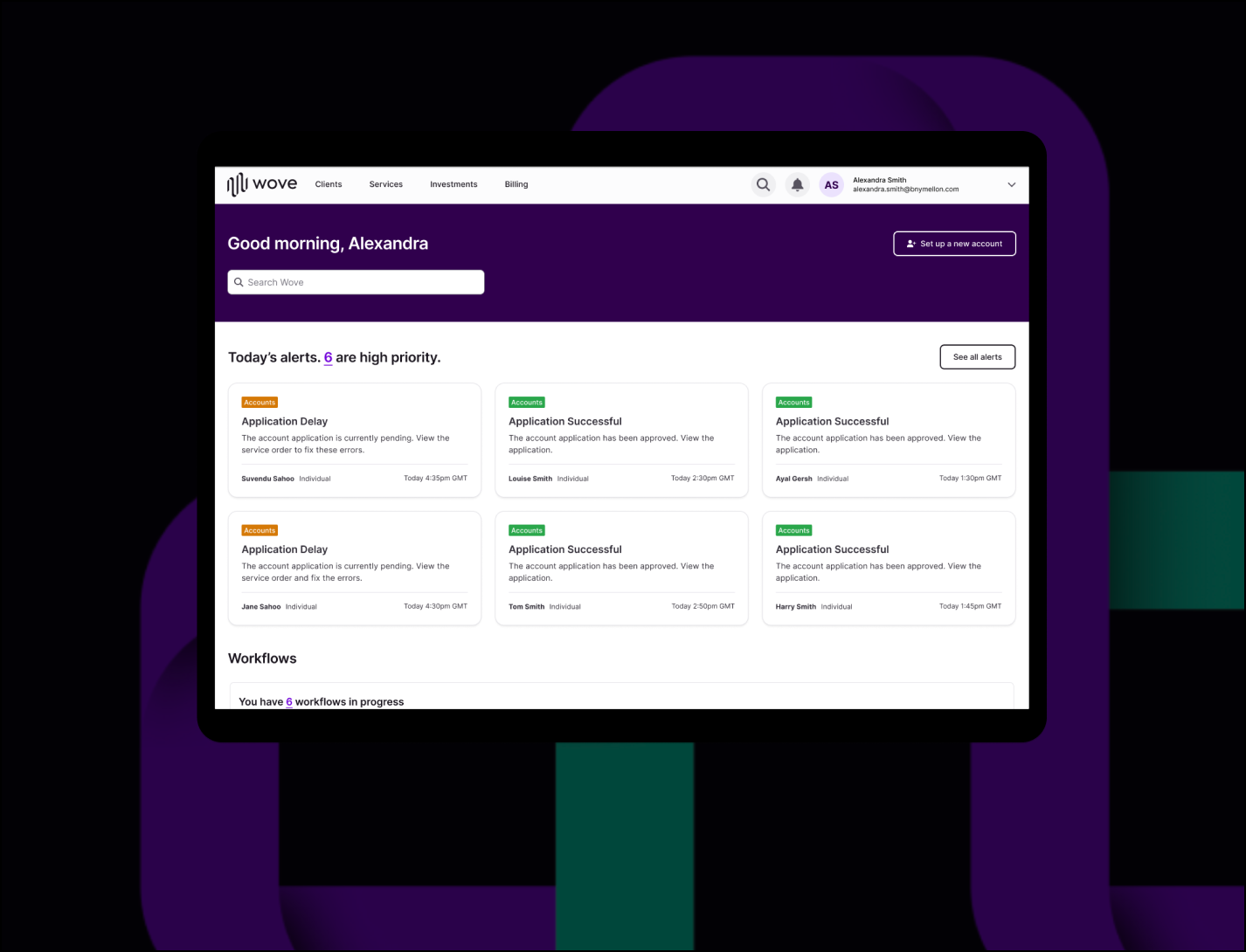
Nexus® wealth management adviser platform
Objectives
The goal was to enhance BNY Mellon’s clients customer retention and attract new prospects. To achieve this we aimed to improve the product UX/UI through the following objectives:
Create seamless, intuitive investor account opening journeys across multiple types
Develop design solutions, leveraging the award winning Pershing X Wove platform
Streamline internal processes and reduce manual interventions
Design a robust, scalable, and modern data architecture
Enable faster time-to-market for enhancements
Solution
Through extensive user research, iterative design, and testing, the team created a dev ready product packed with user-centered optimised journeys and enhanced features that exceeded client expectations.
Simplified navigation to help reduce account onboarding complexity
Faster time to complete account opening
Guided journey design
Single & simplified data entry
Tailored user journeys
Additional product features
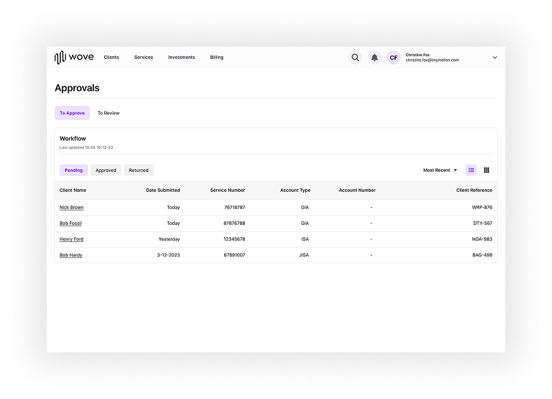
Approval tracking
to provide advisers the ability to log and track account applications.
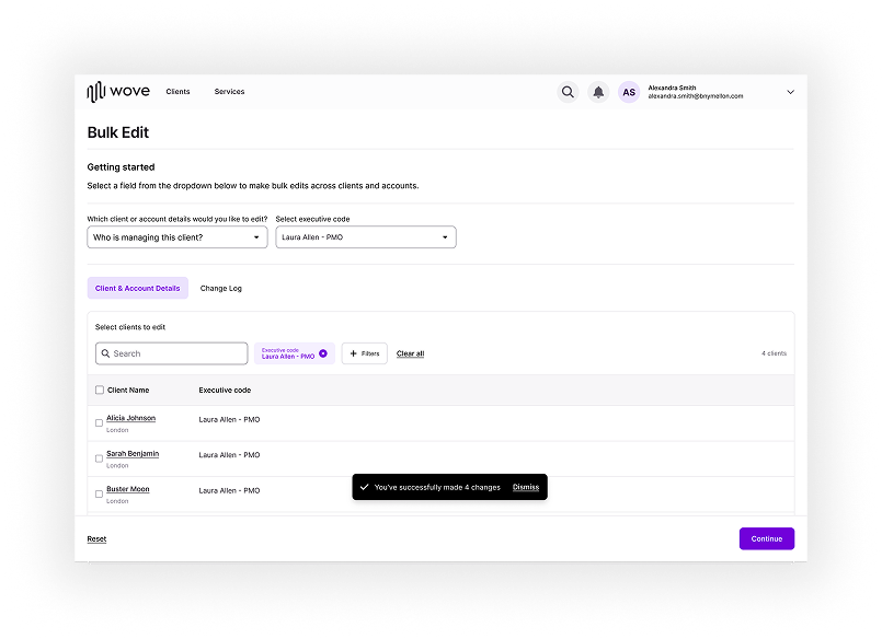
Bulk editing
to provide the ability to select client or account details and edit across multiple clients or accounts.
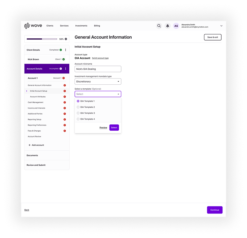
Templates
were introduced to provide the ability to create, save, and access reusable data entry fields.
Business benefits
– Reduction in support requests and complains
– Reduction in technology complexities
– Design System foundational components to support efficient and scalable future platform enhancements
The Design Process
I led a design process through gathering insights to help drive a user-centred solution.

Discovery
User research
Competitor analysis
Stakeholder interviews

Design
Journey mapping
Wireframes
Prototypes

Test
Usability testing
Design iterations
Finalise design
Discovery
A comprehensive set of discovery sessions were run over the course of 20 weeks. Feedback was shaped into actionable insights to inform new user journeys and UX/UI design.
14
Client interviews
20
Stakeholder interviews
600
Pages reviewed
650
Input fields assessed
Key findings
Research was undertaken with four of BNY Mellons clients to understand user needs and pain points of using the Nexus platform. A synthesis of data surfaced 8 core pain points which translate into implications and opportunities for the future state journey.
“There are so many old fields that aren’t really needed, and most aren’t even relevant to corporate accounts”
“To update the address for one person we have to update manually across all their accounts”
“We manually assign people to check all of the fields before we open the account which can take up to 48 hours"
Competitive analysis
We researched businesses that demonstrated best-in-class UX/UI to provide inspiration and help construct a set of design principles.
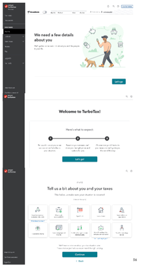
TurboTax, H&R Block & Capital One
Frequently referenced best in class onboarding process

Parmenion
Referenced by clients

Wove
Pershing X owned US platform
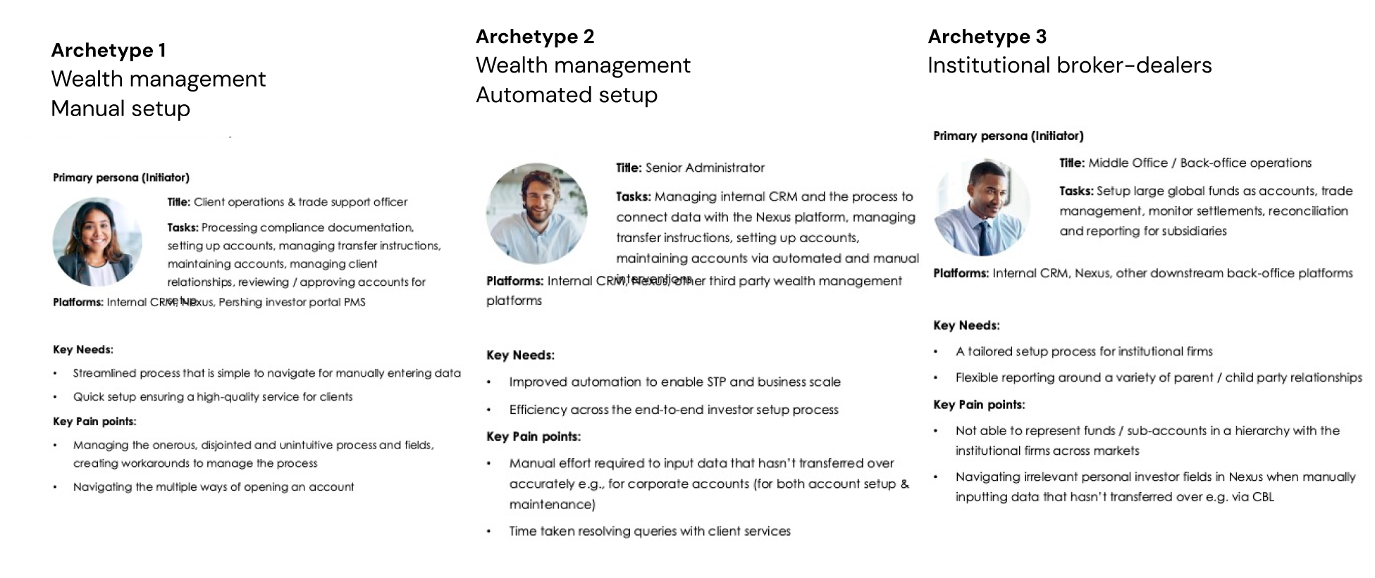
Adviser archetypes
Updated archetypes were created to represent what user needs, goals, and behaviours were based on completing investor setups and maintenance tasks.
Design
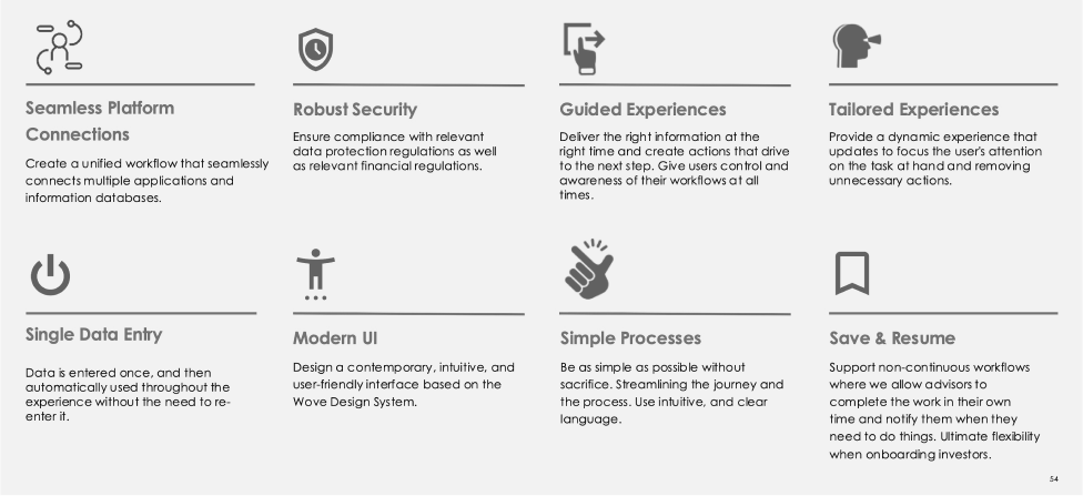
UX/UI principles
I worked with the CX lead and stakeholders to define a set of design principles. These acted as a shared set of rules and values that helped guide decision-making and ensure consistency across the product.
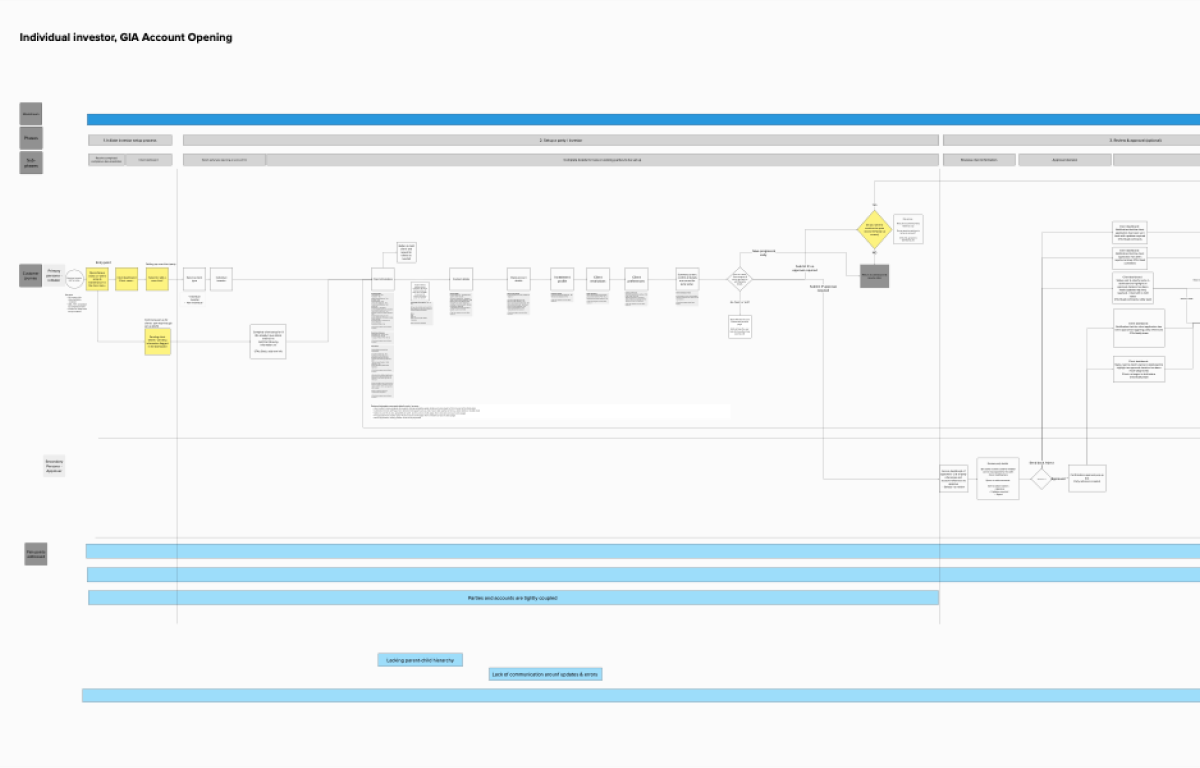
Journey maps
Journey maps were created based of a 6-week discovery phase of work to concept out updates to account opening flows.
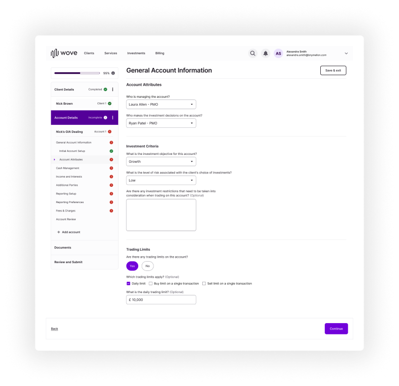
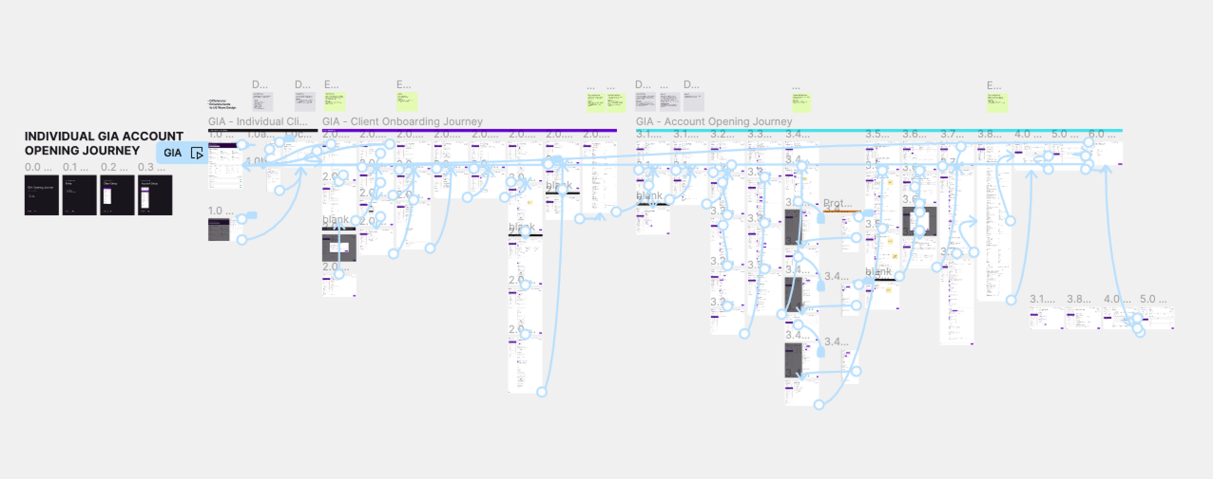
Hi-fidelity journey prototypes
Using the journey maps as the guiding framework, we used the Wove design system to build out hi-fidelity journey prototypes for each account opening journey and maintenance journeys.
The team and I completed 11 user journeys that included:
• 8 account types (GIA, ISA, SIPP etc.)
• 3 new maintenance paths (templares, bulk edits, approval flows)
We planned to test ‘happy path’ journeys with the original group of users to gain insights to help shape the final designs. These user journeys aimed to benefit over 80% of the client base.
GIA account opening journey
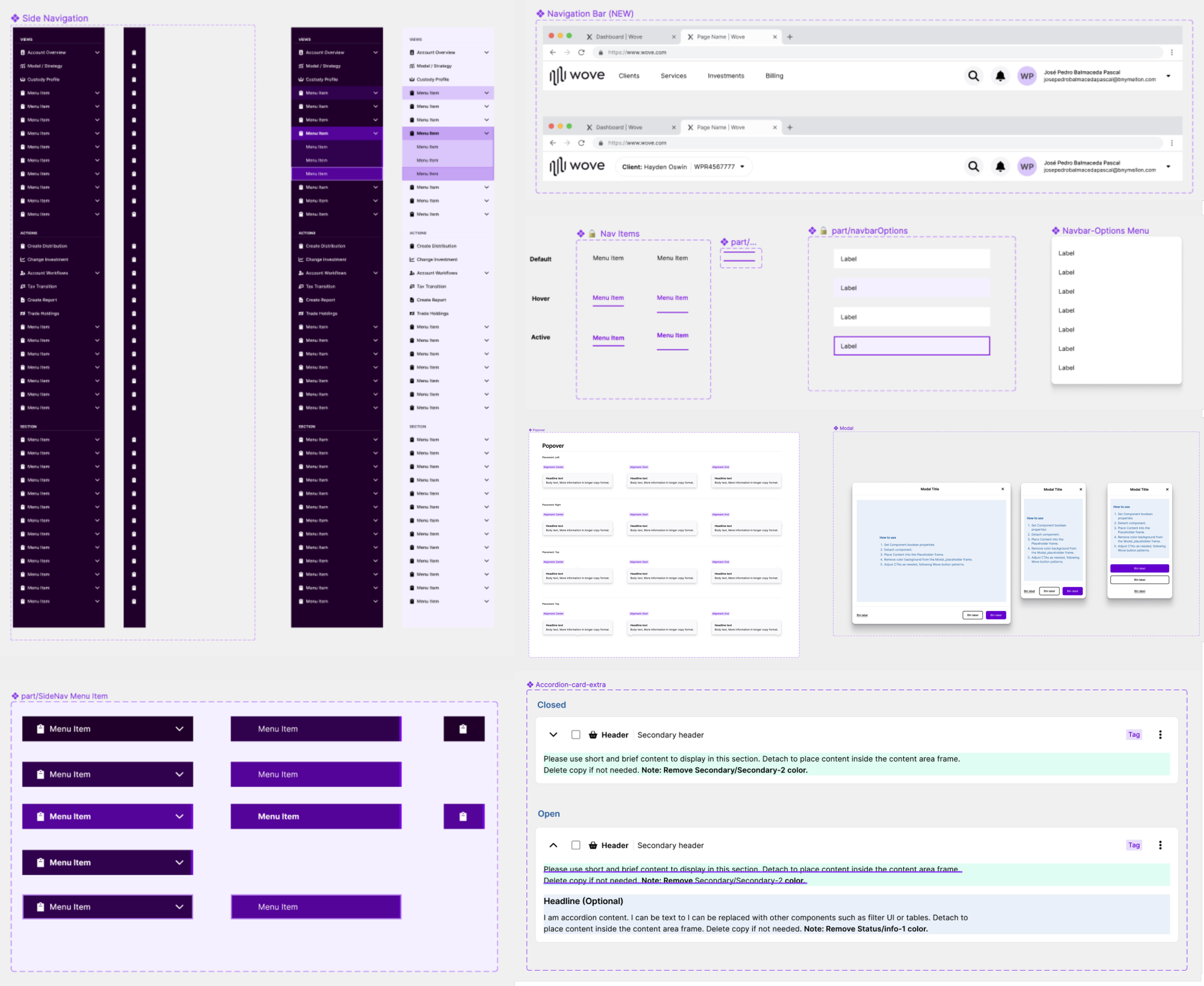
Wove design system
The Wove design system provided a rich foundation of core components from which I developed core user flows that the team and I developed into hi-fidelity prototypes for usability testing.
Test
Usability test method & objective: online 1:1 interviews with 4 of Pershing’s key clients to test manual entry journey flows.
Our research objectives were to gauge reactions around the core account opening journeys we had developed and whether the content and flow was useful and facilitated effective progression through account opening. In addition we aimed to understand:
How well we had addressed the clients pain points
If we were successful in mapping journeys to the design principles
If journeys were aligned with the client’s workflow and the data they collect
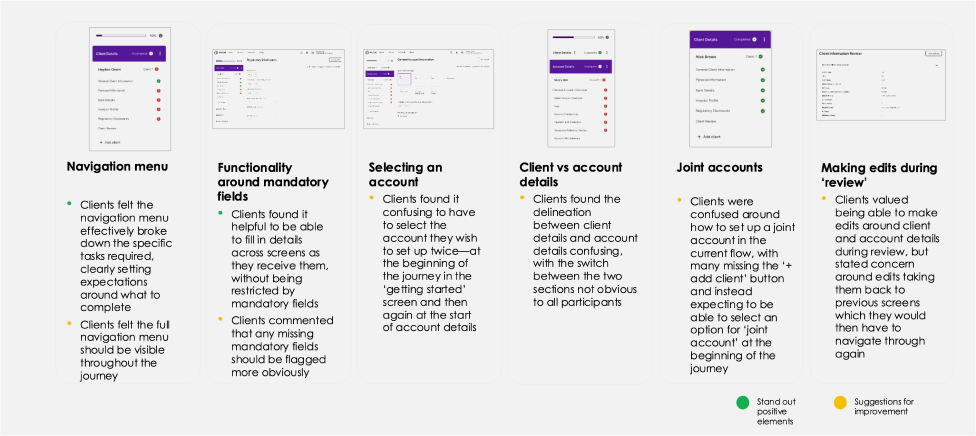
Results & findings
Overall clients felt the journey was much clearer and simpler to navigate through, with targeted areas of focus for further improvement

Journey navigation and flow
Clients found the journey simple, clear and logical to navigate through, but felt some of the core components of the journey should be better signposted, e.g. client details vs account details, and joint accounts.
Project team
Principal strategist Andrew Tan
CX&I manager Emma Kenworthy
Product director Prateek Kulshreshtha
Product manager Ravi Bardia
UX/UI design lead Tim Wolf
UX designer Hannah Yong
UI designer Tian Huang
Data strategy director Ashis Patel
Data strategist Kamalendu Chatterjee
Data strategist Mayur Sharma
Project responsibilities
Conceptual journey flows
User journey mapping
User personas
Usability testing
Wireframing
UX/UI design
Prototyping (Figma)
Design team management
Design system management